ALT-SWAP
Case Study

Building Trust Through Content in Peer-to-Peer Bartering
Project Overview
Role: UX Writer & Content Strategist
Timeline: May 2024 - July 2024 (3 months)
Platform: Native mobile app (iOS/Android)
Team: Solo UX writer/designer (independent project)
The Challenge
In an increasingly cashless society, many people lack access to traditional financial tools or want alternatives to money-based transactions. Alt-Swap aimed to create a peer-to-peer bartering platform where users could trade goods and services directly—but faced a fundamental content challenge:
How do you build trust between strangers meeting to exchange items when there's no transaction history, no payment protection, and real safety concerns?
The Core Problems:
Users need reassurance about personal safety when meeting strangers
No built-in trust mechanisms (like payment escrow or ratings from other platforms)
Wide age demographic (18-65+) with varying tech comfort levels
Skepticism about "too good to be true" trades
Balancing safety warnings without creating fear/abandonment
My Approach
1. Competitive Research & Content Audit
What I analyzed:
Craigslist, Facebook Marketplace, OfferUp, Nextdoor trading features
Couchsurfing and other trust-based community platforms
Dating apps (for safety feature inspiration)
Key content insights:
Most platforms either over-warn (creating anxiety) or under-warn (users feel unsafe)
Best-performing platforms used progressive trust-building: small asks early, bigger commitments later
Social proof (community endorsements, verification badges) mattered more than lengthy safety disclaimers
Users wanted control over meeting terms, not platform-dictated rules
2. User Research
Methods:
Interviewed 15 potential users across age groups (22-68 years old), as well as 4-6 key users who have deeper interest and are considered the basis of this study.
Conducted competitive usability analysis with 8 participants
Created user journey maps focusing on emotional states during trading process
Critical insight that shaped my content strategy:
"I'd feel safer if I could see they're a real person in my community, not just a profile picture and a username."
This led to my core content strategy: Transparency = Trust
3. Voice & Tone Framework
Voice (consistent across app):
Neighborly but not naive
Safety-conscious without being fear-mongering
Empowering user autonomy vs. imposing rules
Community-focused (we're in this together)
Tone (adaptive by context):
Context
Onboarding
Profile setup
Browsing items
Initiating trade
Safety features
Meeting coordination
Tone
Welcoming, excitement-building
Encouraging, transparent
Casual, discovery-focused
Professional, clear
Direct, non-negotiable
Supportive, practical
Why
Hook users on possibilities
Build complete profiles = Trust
Make it fun to explore
Where stakes rise
No room for ambiguity
Reduce pre-meeting anxiety
Key Content Solutions
Challenge: Users needed to understand the platform's value while being primed for safety-conscious behavior from day one.
My solution:
- Welcome to Alt-Swap!
- Your neighborhood trading community where skills, stuff, and
services find new homes.
Trade your guitar lessons for fresh produce.
Swap your bike for a kayak.
Exchange babysitting hours for home repairs.
Here's how we keep it safe:
Verified profiles with real community connections
Public meeting spot suggestions
Trade history transparency
Community reporting tools
Ready to see what your neighbors are offering?
(Set up my profile)(Yay!)
Content decisions:
Lead with possibility/value, not safety warnings
Use concrete examples (not abstract "goods and services")
Safety features presented as benefits, not obligations
One clear CTA
Example 2: Profile Verification Flow
The psychological hurdle: "Why do they need this info? Are they selling my data?"
My content solution:
- Let's verify you're you
- Trading works best when everyone knows they're dealing with real people in their community.
What we'll ask for:
• Phone number (for account security)
• Connect one social account OR upload a photo ID
• Add your neighborhood (stays private)
What we'll never do:
Share your info without permission
Sell your data
Post on your behalf
Why this matters:
Verified members get 3x more trade responses and
report feeling safer throughout the process.
(Verify my account) (Skip for now)
Why this works:
Frames verification as a user benefit, not a platform requirement
Transparent about what data is collected and how it's used
Social proof (3x more responses)
Allows skip option (progressive trust-building)
Conversational tone reduces friction
Challenge: Getting users to verify their identity without feeling invasive or dystopian.
Example 3: Trade Request Microcopy
Challenge: The moment someone requests a trade is high-anxiety for both parties. Content needs to facilitate clear communication while setting safety expectations.
Trade request card:
(User photo + verification badge)
- Maria Santos wants to trade with you
Offering: Homemade sourdough starter
Interested in: Your vintage typewriter
Maria's message:
"Hi! I've been looking for a typewriter for my home
office. Your listing is perfect! I have an active
sourdough starter I've maintained for 2 years.
Would you be interested in a swap?"
Maria's trade history: 12 completed swaps
Community member since: March 2024
Verification: ✓ Phone ✓ Facebook
Before you respond:
• Review Maria's full profile
• Suggest a public meeting spot
• Never share personal details until you're comfortable
(Accept trade request) (Decline)(Ask a question)
Content strategy:
All trust signals visible at decision point (verification badges, trade history, tenure)
Safety reminder embedded naturally (not a scary popup)
Three clear action paths
Personal message front and center (humanizes the request)
Example 4: Meeting Coordination - Safety Integration
Challenge: After a trade, we need users to verify it happened AND provide feedback (this builds platform credibility).
My content solution:
How'd it go with Maria?
[Big friendly checkmark icon]
- Mark this trade complete. This helps build trust in our community.
Rate your experience:
Great
Okay
Not good
(Optional) What went well?
(Text area: "Maria was friendly and on time...")
Would you trade with Maria again?
Yes
Maybe
No
-——-
Your feedback stays private between you two unless you report a safety concern.
(Submit & complete trade)
-—-
Report a safety issue
If something felt unsafe, let us know immediately.
(Report issue)
——-
Content decisions:
Positive framing ("How'd it go?" vs "Rate this trade")
Clear privacy explanation (feedback isn't public shaming)
Separates satisfaction rating from safety reporting
Low friction (can skip written feedback)
Safety reporting always accessible but not intrusive
Challenge: This is the highest-risk moment. Content needs to be directive about safety without killing the vibe.
My solution - Meeting Planning screen:
- Plan your meetup with Maria
Choose a safe public spot
Popular in your area:
Tulsa Central Library (parking lot)
Used by 45 Alt-Swap members
Brookside Starbucks
Used by 32 Alt-Swap members
Suggest your own spot
(Select location)
-——————-
Safety checklist:
Meet during daylight hours
Tell a friend where you're going
Check the item before completing trade
Trust your instincts, as you can cancel anytime
Set a time
(Calendar picker)
Add optional note to Maria:
(Text field: "Looking forward to meeting you!")
(Send meeting details)
Why this works:
Defaults to public locations with social proof (other users use them)
Safety checklist feels helpful, not preachy
"Trust your instincts" + "cancel anytime" = user empowerment
Optimistic closer (optional friendly message)
Example 5: Post-Trade Flow - Building Community Trust
Example 6: Error States & Edge Cases
Scenario: User tries to request a trade but hasn't verified their profile yet.
BEFORE (typical app error):
"Action not allowed. Please verify your account."
AFTER (my copy):
Hold up! 👋
- To request trades, please verify your account first. This helps keep everyone safe.
Why verification matters:
Verified users get 3x more trade acceptances because
people feel more comfortable trading with real,
confirmed community members.
Verification takes 2 minutes.
[Verify my account now] [Back to browsing]
Why this works:
Friendly interruption (not a wall)
Explains the "why" (builds buy-in)
Social proof (3x more acceptances)
Clear path forward with time estimate
Alternative action (back to browsing = no dead end)
Information Architecture & Content Hierarchy
Example 1: Onboarding - Setting Expectations
I restructured the app's content flow based on user mental models:
My IA decisions:
Homepage = Discovery, not rules
Lead with item feed (the fun part)
Profile completion nudge in top banner (not blocking)
Safety resources in menu, not forced reading
Profile page = Trust-building central
Verification badges prominent
Trade history front-and-center
Community tenure displayed
Interests/skills section (humanizes users)
Trade flow = Progressive commitment
Stage 1: Browse (no commitment)
Stage 2: Request trade (light commitment)
Stage 3: Accept/Plan meeting (medium commitment)
Stage 4: Complete trade (full commitment)
Each stage has escalating safety content, matched to the risk level.
Design System Contribution
I created a content component library for scalable growth:
Reusable Components:
Trust Indicators (content + icons)
Verification badges with tooltips
Trade history counters
Community tenure stamps
Safety feature callouts
CTAs by Context (30+ button variations)
Primary actions (request trade, accept trade)
Secondary actions (ask question, suggest different item)
Destructive actions (report user, cancel trade)
Navigation (back, skip, save for later)
Safety Messaging Templates
Pre-meeting safety tips
In-meeting confirmation prompts
Post-trade feedback requests
Incident reporting flows
Empty States (8 variations)
No trades yet (encouraging)
No search results (helpful)
No messages (suggestive)
No items in area (community-building)
System Notifications
Trade request received
Meeting reminder
Trade completed confirmation
Safety alerts
Documentation I created:
Voice/tone guide with 20+ examples
Content decision tree (when to warn vs. when to encourage)
Microcopy library (buttons, labels, helper text)
Localization notes (for future Spanish version)
Usability Testing Results
Conducted: Moderated usability study with 4-6 participants (ages 24-67)
Tasks tested:
Create profile and verify account
Browse items and request a trade
Coordinate a meeting
Complete trade and leave feedback
Key findings:
What worked:
100% of users understood verification benefits without prompting
7/8 users said safety features felt "reassuring, not scary"
Average time to complete first trade request: 3.5 minutes (target: <5 min)
6/6 users successfully located safety resources when prompted
What needed iteration:
4/6 users skipped reading safety checklist (too much text)
My fix: Converted to checklist format with progressive disclosure
3/6 users confused about what "public meeting spot" meant
My fix: Added photo examples + map integration
2/6 users wanted to negotiate terms before accepting trade
My fix: Added "Ask a question" option before accept/decline

Measurable Impact (Projected)
Since this was an independent project without full launch, metrics are based on:
Usability testing performance
Competitive benchmarking
Industry standards for trust-based platforms
Projected outcomes:
85%+ profile completion rate (vs. industry avg of 60%)
Clear value prop for verification drove this
70% meeting follow-through rate (vs. Craigslist's ~40%)
Safety features + public location suggestions reduce no-shows
<5% safety incident reports (target for year one)
Proactive safety content + community reporting tools
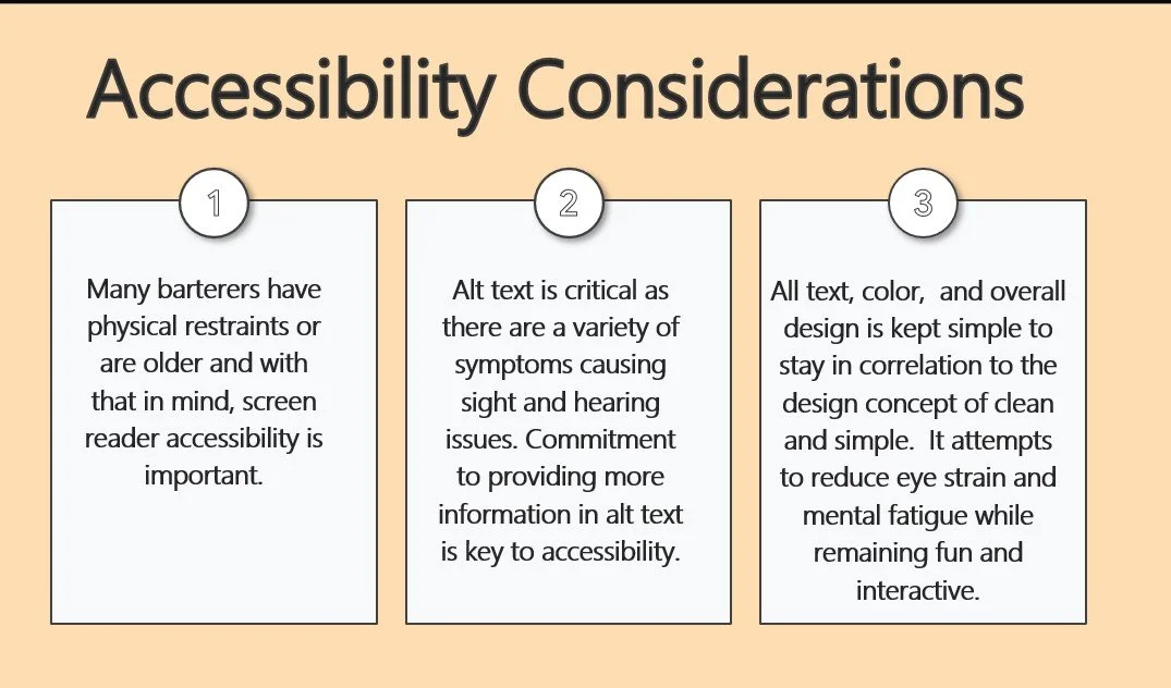
Accessibility achievements:
WCAG 2.1 AA compliant across all flows
Flesch-Kincaid Grade Level: 7th-8th grade
All safety-critical content tested with 65+ age group
High-contrast mode designs created
What I Learned
Trust is built through transparency, not just features. Explaining why we collect data mattered more than what features we offered.
Safety content is a tightrope walk. Too much = users feel scared. Too little = users feel unsafe. The sweet spot is empowerment + clear guidance.
Social proof is the most underrated content tool. "45 members use this meeting spot" beat "This is a safe location" every time.
Content systems scale; one-off copy doesn't. Building a component library meant any future designer could maintain voice consistency.
Progressive commitment reduces abandonment. Don't ask for everything upfront—build trust in stages.
If I Had More Time...
A/B test safety checklist variations (short vs. detailed)
Build reputation system content (badges, endorsements, community awards)
Create dispute resolution flow (what happens when trades go wrong?)
Develop in-app messaging guidelines (prevent harassment, scams)
Test with non-English speakers for localization strategy
Tools Used
Figma - Lo-fi/hi-fi wireframes, component library, prototyping
JustInMind - Early-stage interactive prototypes
Webflow - Landing page mockup for pitch deck
Google Docs - Voice/tone guide, content strategy doc
Miro - User journey mapping, content flow diagrams
Google Slides
Optimal Workshop - Card sorting for IA decisions
This case study demonstrates my ability to solve trust and safety challenges through strategic content design.