The Modern Mermaid
Designing a Dreamy, Ocean-Inspired Shopping Experience
Project: The Modern Mermaid - ShimmerTime Collection
Industry: Fashion & Beauty E-Commerce
Categories: Makeup · Clothing · Jewelry
Role: UX Writer/Designer
Goal: Create an immersive, on-brand shopping experience that feels as magical as the ocean itself - complete with mermaids.
Case study
The Challenge
The Modern Mermaid is a world. The challenge was to create UX copy that:
Matched the brand's ethereal, ocean-inspired aesthetic without sacrificing clarity
Made navigation feel intuitive across three distinct product categories (Makeup, Clothing, Jewelry)
Built trust and encouraged conversion without breaking the brand's dreamy tone
Attracted a niche audience (ocean lovers, fantasy enthusiasts, aesthetic shoppers) while remaining accessible to all
Key UX Writing Decisions
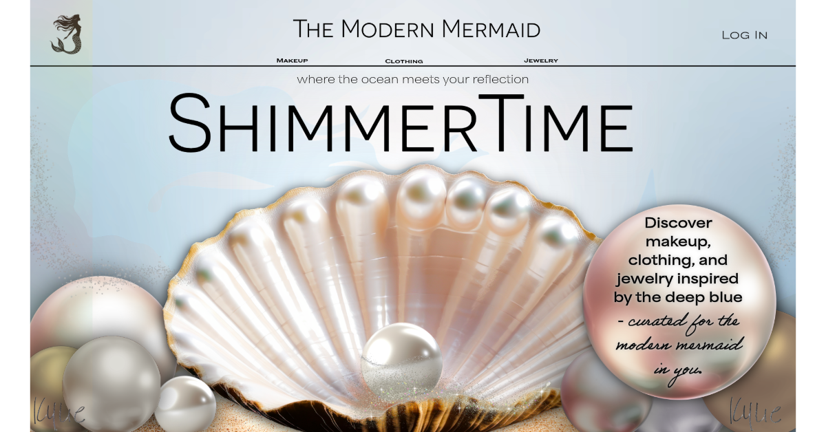
Hero Section
Headline:
“Where the ocean meets your reflection.
Subheadline:
“Discover makeup, clothing, and jewelry inspired by the deep blue - curated for the modern mermaid in you.”
CTA:
Dive In (Not “Log In”)
Category Introductions
Makeup - Luminous Depths
Shimmers, pearls, and oceanic hues: makeup that makes you glow like sunlight on the sea.
Clothing - Tidal Threads
Effortlessly fluid. Beautifully coastal. Wear the ocean wherever you go.
Jewelry - Treasures of the Deep
Pearls, shells, and sea glass; handpicked pieces that tell a story only the ocean knows.
Empty Cart State
Your treasure chest is empty. The ocean is full of beautiful things - go find yours.
CTA: Start Exploring
Trust & Reassurance Copy
Safe & Secure Checkout
Free returns within 14 days
Sustainably sourced where possible
Every piece is curated with intention
UX Writing Approach
The copy needed to do three things simultaneously:
Immerse: Pull the user into the brand world
Inform: Clearly communicate product categories and actions
Convert: Guide users toward purchase without feeling pushy
The tone was set as: Poetic and purposeful. Dreamy and direct.
Navigation Labels
Generic Label: The Modern Mermaid
Makeup: Makeup
Clothing: Clothing
Jewelry: Jewelry
Note: Navigation labels were kept clean and simple as the brand voice lives in the inside copy, not the nav.
Log In Screen
Headline:
Welcome back, Mermaid.
Field Labels:
Email
Password
Helper text under password:
Forgot your password? Retrieve it here.
CTA:
Dive Back In
New user prompt:
New to The Modern Mermaid? Join our world.
Footer Tagline
“Somewhere between the sea and your soul.”
UX GOALS SOLUTIONS
Immediate brand clarity ———> Strong hero headline + visual ident alignment
Emotional connection ———> Poetic, ocean-themed microcopy throughout
Easy navigation ———> Clean, simple nav labels - no confusion
Trust building ———> Reassurance copy, secure checkout, return policy
Conversion ———> On-brand CTAs that feel inviting, not pushy
Reflection
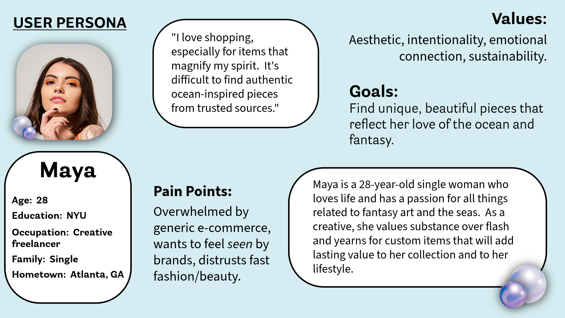
The Modern Mermaid presented a beautiful creative challenge: how do you write copy that feels like magic while still functioning like a great e-commerce experience? The answer was balance, mindfulness, and letting the brand voice breathe itself into headlines and microcopy, while keeping navigation and functional elements crystal clear. Every word was chosen to make the user feel like they'd discovered something rare and special, exactly what our user, Maya, was searching for.
Why I Made These Decisions - A Rundown
Here's my thinking behind the key choices:
"Dive In" instead of "Shop Now": "Dive In" is on-brand and action-oriented. Users still know what to do.
Simple navigation labels: I kept Makeup, Clothing, and Jewelry straightforward because navigation is a functional element.
Category names like "Tidal Threads" and "Luminous Depths": These live inside the left menu. Poetic language enhances the experience here.
"Welcome back, Mermaid": Personalizing the log-in screen with brand language makes returning users feel seen and part of a community, not just a transaction.
Empty cart microcopy: Instead of a cold "Your cart is empty," I turned it into a brand moment that urges users back to browsing.
Trust copy with ocean-themed framing: Pairing trust-type signals with the brand aesthetic keeps the experience cohesive and doesn't “jolt” the user out of the world that’s been constructed.
Footer tagline: "Somewhere between the sea and your soul" is memorable and emotional, which are great for brand recall.