“terply”
Website
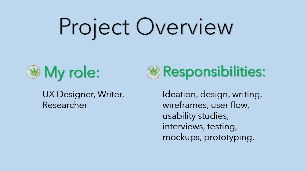
Project Overview
The product
Terply website is a companion to the Terply app designed for cancer and other serious illness patients to conveniently and quickly locate in their area the exact cannabis medication needed for relief
My Role
UX Designer, Writer, Researcher
Responsibilities
Ideation, Design, Writing, Wireframes, User Flow, Usability Studies, Interviews, Testings, Mockups, Prototyping
Tools Used
Figma, JustInMind, PowerPoint, Organic Processor, Adobe Express, Canva
Project Duration
May 2024 - July 2024

Understanding the user
User research, Personas, Problem Statements, User Journey Maps
My user research was multi-fold. I assumed the approach of empathizing with the user, understanding the progression of their illnesses, treatments, pain, symptoms, and mental health. With this, I included the issues surrounding travel, cost, potency, dosage form, and other logistics that make up ensuring patients in need are prioritized.
Problem and Goal
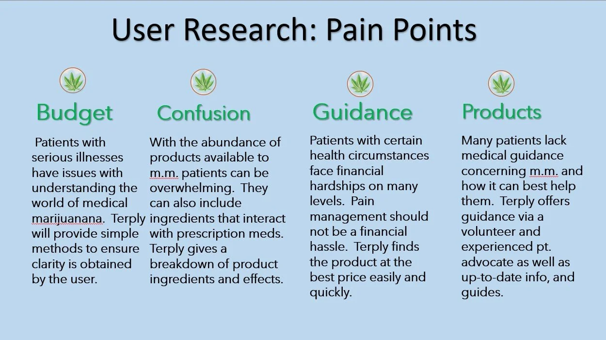
Pain Points
While the Terply website is a sister to the Terply app, I ensured that with everything the app offered, the site offered, and more. Users who may not have access to the mobile app can complete the same objectives via a computer.

Persona - Jen
One of the specific issues surrounding the medical marijuana community is specific patient care for the average person. While patient advocates are a must and currently caregivers can receive a medical marijuana card to purchase medication for their patient (family member or friend), the education and access still need to be there regardless of “who” is purchasing.

User Journey Map- Jen
There are indescribable feelings when one lives with a chronic illness or disease and one of them that is unrelenting is pain and/or anxiety. When we are in pain, we are more easily confused and impatient. Using Terply can remove some of the overwhelming tasks they face when maintaining pain and anxiety levels.
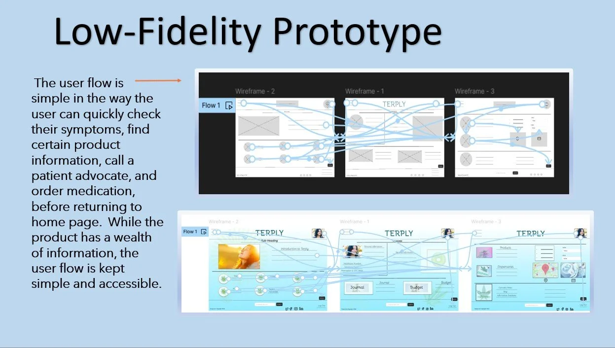
Starting the Design
Paper wireframes, lo-fi prototypes, digital wireframes

I kept the user, Jen, at the forefront of my design process. I wanted to ensure lightheartedness with excellent information as well as user flow ease and accessibility.
The user is easily capable of moving through the pages, along with the flow of ordering and an always accessible chat button.

My interviews validated the assumption that some have trouble using mobile applications and feel more comfortable both physically and mentally using a computer or tablet.

Less clutter on a website is a good thing yet an even better thing for those experiencing confusion, pain, anxiety, or discomfort.
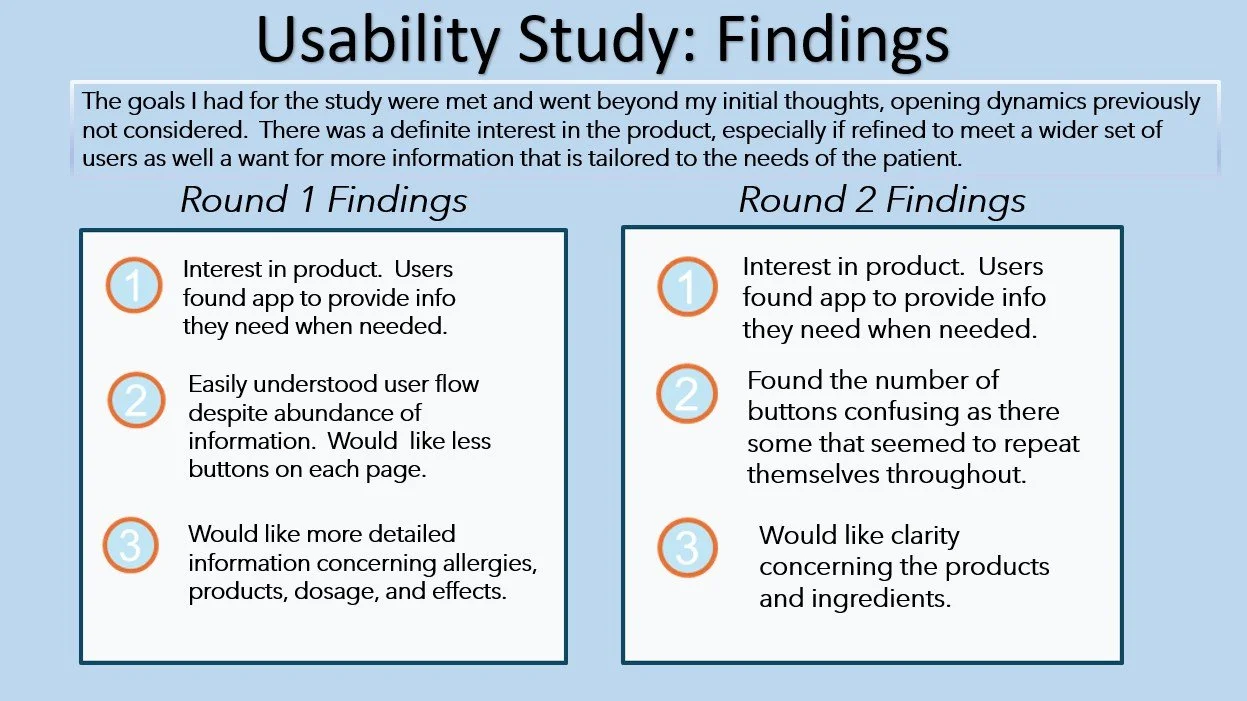
Again the goal was clear; ensuring less clutter and more info to travel between pages.
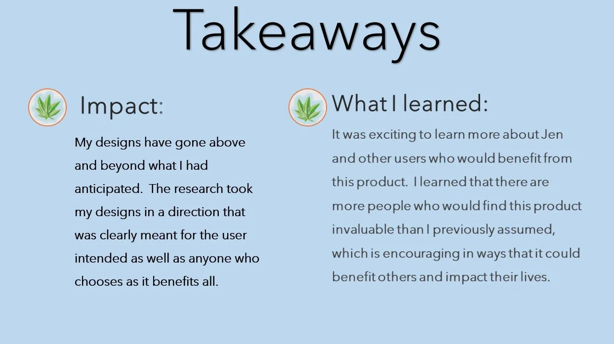
The interest in Terply exceeded what I had assumed. The clarity alone in ingredients and prescription meds contra-indicating each other is an invaluable tool.
Refining the design
Mockups, prototype, accessibility, usability study
After conducting the usability study, I was able to complete the designs with the user in mind. I wanted to ensure the design was pleasing and fun while maintaining its integrity and flow. Designing the website allowed for more freedom of expression in areas relevant to the product.
Mockup - Before and After Usability Study

Adding a 24/7 live chat function is key for patient health and wellness.

Mockup - Before and After Usability Study
I love how the elements add an uplifting element, ensuring happiness awaits, because it does!

Next Steps and takeaways
On the horizon…
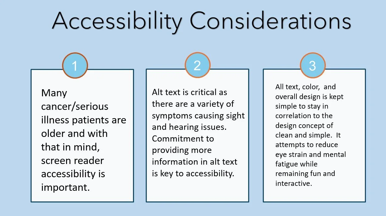
While accessibility is always key, it is especially important in this app because of the nature of the users who engage in the app.
The medical marijuana dispensaries owners and managers I spoke with in the greater area felt it would be a productive product for their businesses and patients. They’ve expressed interest and are open to testing.

I am curious to know what a wider study would show regarding interest and usability in the real world. The help it could bring to seriously ill patients, as well as the elderly, is something to consider heavily. It can also bring great adherence to the cannabis community at large and as a whole.
Extras!
Notes, drawings, and designs…
Notes
Notes

User Persona - Juan
Designing the Terply website was great as I had much of the research done for the app. The design was fun as my intention to convey uplifting vibes was fulfilled. The world of cannabis as a pain and anxiety reliever is essential to any patient.

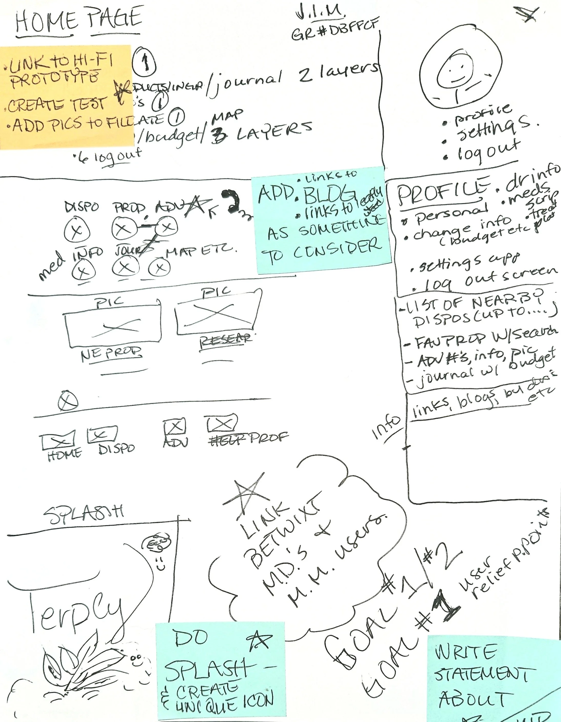
User Flow w/ Connects - Hi-Fi